
The 5-point pattern explained round by round, mini stars for the tree and gift wrap, a stiff tree topper, the 5-petal...



Autumn Winter 2026-27 Fashion Colors
For those born in August who feel summer running through their veins, preparing for autumn is a bit of a heartbreak. But as we near the end of summer—with holidays making time fly faster than ever—it's time to look ahead to the colors we'll be wearing in the coming months.
Next season's fashion seems to have very clear ideas: we still need to feel protected, but we no longer want to go unnoticed. The Autumn/Winter 2026-27 runways play with a continuous alternation between comfort and surprise. On one hand, we find cozy browns, deep greens, terracotta, and creamy neutrals; on the other, vibrant fuchsias, purples, bright blues, and almost electric yellows burst onto the scene.
Pantone describes the season as a balance between authenticity, discretion, and a desire to experiment: thoughtfully curated earthy colors and neutrals coexist with vibrant, energetic, and intentionally unexpected shades.
Chocolate brown is here to stay, but it's getting even more delicious

Did you think fashion had already grown tired of brown? Absolutely not.
For Autumn/Winter 2026-27, chocolate confirms its status as one of the new wardrobe essentials. Deep, elegant, and incredibly versatile, it takes the place of black in coats, tailored suits, flowing dresses, and especially in knitwear.
Alongside classic chocolate brown, even warmer and spicier shades are emerging: cocoa, toffee, coffee, mahogany, and a reddish-brown that Pantone identifies with names like Arabian Spice, Red Mahogany, and Cocoa Powder.
Its greatest strength? It manages to look luxurious even when worn in the simplest way possible.
A cocoa-colored cardigan over a white shirt, a coffee-colored bag paired with denim, or a chocolate dress illuminated by gold accessories: you don't need to add much else.
The most interesting pairings: powder blue, dusty pink, butter, olive green, cream, and deep red.
Green: Divided between nature and the future

There isn't just one green for winter 2026; there are at least two, and they tell completely different stories.
The first is natural, deep, and reassuring. We are talking about burnt olive, forest green, and mossy shades that seem made for wool coats, chunky cardigans, textured bags, and minimalist dresses. Pantone includes Burnt Olive, a layered and sophisticated green, among the colors of the season, along with Neptune Green, more aquatic and with a retro charm.
The second is decidedly more irreverent: lime, chartreuse, yellow-green, and Green Glow. It's the color that suddenly pops up under a gray coat, on an oversized scarf, or on a bag that has absolutely no intention of being discreet.
It is precisely this contrast that makes green one of the season's key players: on one hand, it grounds us to the earth, while on the other, it seems to come straight from the future. WGSN and Coloro also identify bright green as one of the key accents for Autumn/Winter 2026-27.
Blue is no longer just a reassuring color

Blue is back, but this time it doesn't want to limit itself to being just a polite alternative to black.
The runways showcased more energetic and luminous shades, from power blue to powder blue, passing through maritime blue and teal. Prada, Dior, and Chanel chose it to bring an almost spring-like vitality to fluid fabrics, shirts, coats, and structured suits.
On one hand, we find ice blue, delicate yet far from fragile; on the other, intense blue, bright and saturated, like All Aboard, selected by Pantone as one of the key colors of the season. At the base remains navy, which on the Autumn/Winter 2026 runways proved it can be just as impactful as black.
The real novelty, however, is how it is paired: not only with white and beige, but with brown, red, lilac, green, and even bubble-gum pink.
The combination to try: bright blue and chocolate. Unexpected, elegant, and much easier to wear than it seems.
Transformative Teal: The Color That Bridges Blue and Green

Halfway between petrol blue, deep green, and dark turquoise, we find Transformative Teal, named by WGSN and Coloro as the signature color of 2026.
It is a complex shade, capable of conveying both change and stability at the same time. It is not as vibrant as summer turquoise, nor is it as dark as classic forest green: it possesses an almost magnetic depth, looking particularly stunning on velvet, wool, satin, and yarns with a subtly luminous surface.
It works beautifully for an entire garment, but also as an accent: a bag, a turtleneck, a pair of gloves, or a headband.
Paired with cocoa it becomes sophisticated, with purple it looks creative, and when matched with cream or Wax Paper, a warm, slightly yellowish white, it takes on a surprising radiance.
Purple: Not a Shy Lilac, but a True Showstopper

Winter 2026-27's purple is not made to blend in; the most interesting shades are dense, rich, and slightly vintage: eggplant, plum, amethyst, and Fresh Purple, an intense hue chosen by WGSN and Coloro as one of the key colors of the season.
It is a purple that recalls certain 1980s evening gowns, but is updated through cleaner silhouettes, oversized knitwear, statement coats, and geometric accessories.
Worn head-to-toe, it can feel theatrical; however, used on a single piece, it becomes surprisingly wearable. A purple sweater with grey trousers, a plum bag with a camel coat, or an amethyst scarf over a total black look are small color experiments with a very high style payoff.
The chicest pairing: purple and brown.
The boldest pairing: purple and red.
The runway pairing: purple and bright green.
Pink loses all its shyness

While powder pink played the romantic role in recent seasons, for Autumn/Winter 2026-27 it has decided to raise its voice.
Fuchsia remains among the most energetic shades, flanked by bubble-gum pink and deeper versions, almost purplish. Pantone includes Festival Fuchsia, vibrant and celebratory, in its New York palette, but also Foxglove, a softer pink with a nostalgic, mauve undertone.
Bottega Veneta, Vaquera, Diesel, Chanel, and Prada have helped make bright pink one of the most recognizable colors of 2026, applying it to shirts, satins, dresses, and tailored constructions that strip it of all innocence.
The secret to wearing it without feeling overwhelmed? Let it dialogue with more understated colors: gray, chocolate, navy blue, or olive green. Or do the exact opposite and pair it with red. Because, apparently, the old rules of color matching have officially retired.
Terracotta, paprika, and brick red: autumn returns to its roots

Some colors seem to capture the entire season in a single shade, and that's the case for terracotta, copper, paprika, and burnt reds that we will see on coats, bags, suits, dresses, and knitwear. Pantone proposes Muted Clay, a soft and rustic terracotta, while the Pre-Fall 2026 collections highlighted a family of burnt oranges and brick reds nestled among neutrals. These are warm, cozy, and easy-to-use shades, especially for those who love natural colors but want something more vibrant than the usual beige.
Terracotta pairs beautifully with cream and camel, but becomes more contemporary next to powder blue. Brick red matches perfectly with denim and chocolate, while paprika can light up even the most classic grey coat.
Yellow continues to shine even under your coat

Butter yellow is here to stay even after summer ends; it becomes creamier, warmer, and softer, acting almost like a neutral color.
Marni, Erdem, and Prada featured it in their Autumn/Winter 2026 collections, often pairing it with brown, navy blue, and cream. But alongside these delicate shades, the more exuberant side of yellow also emerges: Acacia, an intense hue with a hint of green, and the ultra-bright Green Glow. These colors are designed to break up the predictability of your winter wardrobe with a scarf, a detail, a bag, or a statement sweater. You don't need to go for a total look; sometimes, a single accessory is enough to make an outfit put together five minutes before heading out look completely intentional.
The New Neutrals Are Anything But Boring

The return of bright colors doesn't mean that beige, cream, and gray will disappear; they simply become much more interesting.
Among the shades destined to build the foundation of your wardrobe, we find Egret, a creamy and natural white; Candied Ginger, a warm and comforting beige; Toffee, elegant and contemporary; Underworld, a bold medium gray; and Poseidon, a deep oceanic blue.
WGSN and Coloro add Wax Paper, a light neutral with a delicate yellow undertone, perfect for replacing optical white in winter looks.
The real difference will be made by textures: brushed wool, bouclé, velvet, three-dimensional stitches, shiny surfaces, and soft yarns.
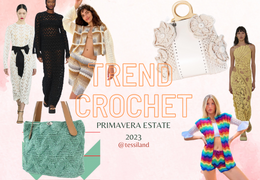
What's trending in crochet for Autumn/Winter 2026/27?
This is probably where the Autumn/Winter 2026-27 palette shows its most fascinating side.
Cocoa and mahogany enhance structured cardigans and clean-shaped bags. Transformative Teal is perfect for capes, stoles, and elegant sweaters. Purple finds its place in three-dimensional stitches and geometric patterns, while fuchsia, bright green, and Acacia yellow can become borders, floral motifs, or small contrasting details.
For a more delicate project, you can combine powder blue, cream, and mauve pink. For a sophisticated result, cocoa and teal. For a creation that won't go unnoticed, purple and chartreuse.
The real trend won't be choosing a single color, but building personal combinations, capable of transforming every handmade garment or accessory into something that couldn't belong to anyone else.
Winter 2026-27 refuses to blend in
Between earthy tones and almost digital shades, the new season speaks of the need to feel safe without giving up the chance to surprise.
Brown wraps around us, blue reassures us, green reconnects us to nature, and then fuchsia, purple, and yellow arrive to remind us that dressing up can still be an instinctive, fun, and deeply personal act.
And perhaps this is the most important color trend of Autumn/Winter 2026-27: not choosing between elegance and creativity, but finally wearing them together.
Rosaria Tessiland®



Leave a comment