


A trendy, practical guide to choosing the perfect zodiac jewelry: signs, colors, stones, and handmade...
spedizione gratuita presso un FERMOPOINT
€19.00
Carrello della spesa
0 prodotti
Sblocca
i tuoi premi
A trendy, practical guide to choosing the perfect zodiac jewelry: signs, colors, stones, and handmade...
In an increasingly grey-scale world, this article invites you to put color back into circulation with style and...
Discover what Tessiland’s VIP Room is: the Tuesday live at 5:00 PM where you’ll find previews, creative kits, and...
The crochet Toffee Bag is late winter 2026’s caramel bag: a cozy-chic design with a faux-fur detail, clean lines, and...
A mini magazine-style guide to celebrate Valentine’s Day with crochet: 3 projects made by us and paired with...


There’s a question that pops into my head every time I cross a parking lot, step into a home decor store, or scroll through social feeds: have we really decided that personality is out of fashion?
Because if you look closely, the world is turning into a giant swatch book of anonymous tones: white, grey, black cars; house exteriors in fifty shades of grey; interiors that seem designed not to bother anyone—not even the people who live there.
And no, this isn’t an attack on beige, grey, or neutrals—the problem is when it turns into a dogma. As if someone decreed that good taste equals zero risk. And if you think about it, it’s a convenient choice because neutrals work for everyone: they don’t divide, they don’t scare, they resell better.
But us? Where do we end up inside this elegant sameness?
This is where our niche comes in: CREATIVES.
A creative is someone who doesn’t just wear things—they translate a mood, an identity, an idea into shapes and colors. And if the world is fading, we’re exactly the ones who can make the difference.
Being creative doesn’t just mean knowing how to make things. It means knowing how to see, combine, transform, imagine alternatives. It’s a mindset before it’s a skill.
A creative:
-doesn’t just buy a garment: they buy a styling possibility;
-doesn’t just look at yarn: they see a project and a palette;
-doesn’t stop at “it suits me”, they think “it represents me”.
And here, color becomes a social indicator. Generations use it differently: those who lived through more formal years often keep it in the details; those growing up in a hyper-visual world use it as a personal signature; those going through change rediscover it as energy.
Color, in short, isn’t just aesthetics—it’s a statement, sometimes even a kind of repair after grey periods (inside or out). Color comes back as a “I’m taking my space back”.
There’s no perfect number—there’s a practical rule: color has to be intentional. Even when it’s small.
If you live in black, grey, beige, there’s no need to revolutionize everything. Pick one color that instantly makes you feel present (petrol, burgundy, emerald, smoky lavender) and use it as your signature: bag, scarf, hat, earrings. Repeated over time, it becomes identity.
-60% base (neutral or soft color)
-30% second tone (coordinated)
-10% accent (plot twist)
Example: cream (60) + camel (30) + emerald green (10).
It works in an outfit, but also in home decor: a neutral sofa, a warm rug, a colored cushion. And yes, it works beautifully in a crochet project too: neutral body, secondary edging, wow detail.
Stay in the same color family—just change the intensity. Midnight blue with powder blue. Antique pink with burgundy. Sage green with forest green. Result: sophisticated, modern, zero panic.
February is a bridge month: craving light, but still needing comfort. These combos work well for looks, accessories, and even yarn palettes.
 (14).jpg)
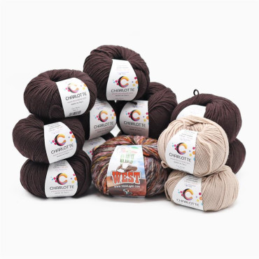
I nicknamed this pairing the joy combo because it comes from a real story (and a seriously successful color plot twist). On a call with a customer who was a bit down because a product won’t be coming back into the catalog, we were looking for an alternative to pair with her blush yarn: she was thinking of a classic cream, maybe with a thread of sparkle.
Then I suggested a less obvious option: bordeaux—specifically the bordeaux of Chuck Lurex. Her reaction was immediate: I hadn’t thought of that. And that was exactly the point: bordeaux adds depth, blush softens, and lurex brings the extra touch without overdoing it. Problem solved—mood too.
How to use it fast: blush as the base, bordeaux as the accent (edge, detail, accessory), and a lurex strand only where you want the light to pop.
 (15).jpg)
If you want to step away from beige without making noise, powder and brown is the chicest answer. Brown (chocolate, cacao, mocha) brings structure and depth; powder (powder blue or dusty pink) adds light and refinement: together they instantly create a polished, warm, modern look.
How to use it fast: brown base with a powder detail (scarf, bag, garment edging), or powder as the star with brown defining outlines and accessories. Perfect in yarn form too: warm-toned body, powder accent to lighten it up.
 (17).jpg)
Petrol and orange is the perfect pairing if you want real color—but with taste. Petrol keeps everything elegant and deep; orange (burnt, pumpkin, rust) lights it up without going too far: together they create an instantly bold, contemporary look—creative-who-knows-what-they’re-doing energy.
How to use it fast: petrol as the base (knit, coat, main accessory) and orange as the accent (edges, details, handles, inserts). For a more easy effect, choose a warm, muted orange: still lively, super wearable.
 (16).jpg)
Olive green and burgundy is the ideal pairing when you want color with elegance. Olive green softens and makes everything brighter; burgundy adds depth and character: together they create a refined contrast—never loud—perfect for February and already spring-ready.
How to use it fast: olive as the base (knit, scarf, main piece) and burgundy as the defining detail (piping, edging, accessory). For a more fashion-forward result, flip it: burgundy as the star, olive to brighten the smaller parts.
 (18).jpg)
Lime and royal blue is a pairing that makes a statement, but with a clear logic: royal blue brings structure, presence, and an instantly fashion-forward vibe, while lime adds that fresh energy that breaks through any grey. Together they’re graphic, modern, and absolutely for creatives who aren’t afraid of color.
How to use it fast: royal blue as the base with lime in small but strategic details (edges, handles, accessories) if you want to keep it wearable; or lime as the star with royal touches for a statement effect—perfect on a handmade piece that becomes the center of the look.
.jpg)
For spring 2026, the palette gets more interesting because it mixes warmth and powder, intensity and softness, without ever feeling “cute” in a basic way. If I had to pick three key colors to have in your wardrobe (and in handmade projects), I’d go for these:
-Siena earth, energetic and grounded,
-Lavender, in its smokier, more grown-up version,
-Mauvewood, a mauve shade that sits between pink and purple, perfect for giving character to pastels without dulling them.
If dressing colorful intimidates you, do something smart: wear a color you created yourself. A handmade accessory is the perfect alibi—and also the most believable one: it’s not a whim, it’s a piece of identity.
Pick one of the 5 combos above and turn it into a small project: a scarf, a hat, a bag, a home decor accessory. Meanwhile, we’ll pick ours and get the next project ready to share with you.
So, no more life in shades of grey—from here on out, all color.
Rosaria Tessiland®

Leave a comment